Blackbird Brand Identity
Blackbird is a streetwear apparel concept that is inspired by the vibrating energy of the city. The brand represents the beauty and creativity hidden in the cracks of cement and buzzing neon bulbs. Artistry and urban fashion come together to create a streetwear brand that is fearless and effortlessly stylish.
The Brief
Create a full brand identity for a streetwear apparel company with a logo and icon that are bold, timeless and unique. Curate a colour palette, typeface and imagery to accentuate this up-and-coming brand. Write a captivating and cohesive brand narrative that speaks to todays young people.
-
Brand Strategy
Brand Creative
Art Direction
-
Illustrator
Photoshop
Indesign

Brand Strategy
Tagline
Apparel with Audacity
Mission
Blackbird is fashion infused with creative audacity inspired by the cold concrete landscapes and diverse subcultures that weave the fabric of the cities we live in. Blackbird captures the electric energy of urban life fusing creativity and style to curate apparel that resonates with the daring and the bold. Embracing authenticity and pushing boundaries in every design, Blackbird seeks to set trends not follow them.
Vision
Blackbird took flight from a passion for bold and creative expression through fashion. We aim to become a leading force in the streetwear industry. Known for our creative and unexpected designs, high-quality craftsmanship, and commitment to authenticity, we inspire individuals to embrace their unique identities. Through strategic partnerships, collaborations, and community engagement, we seek to cultivate a loyal community and create meaningful connections with our customers. Blackbird is a means to empower people to challenge convention and live without limits.
Brand Story
Blackbird began in the sprawl of the city. It’s a story of the wanderers — those who find beauty and calm hidden in the cracks of the concrete and the chaos of bustling intersections. We are fuelled with a passion for self-expression. Every design — every stitch — tells a story of creativity, fearlessness, and authenticity.
Soaring above conventions and embracing the freedom to create without limits, Blackbird is an extension of our creative imagination. We are endlessly captivated by the gritty landscapes that envelop our surroundings. From the transient melodies of street buskers, to the kaleidoscope of underground scenes, Blackbird seeks to capture the vibrating energy that pulsates through the city. Our apparel is designed with intention, and without fear. We are more than just a clothing brand Blackbird captures a way of being. A symbol of authenticity and liberation; empowering the dreamers to break the cage and live without limits.
Blackbird is a love story — an ode to the cities we call home. We express the beauty of our urban environments through creative and daring designs, combined with quality and authenticity. Join us on our relentless pursuit of creativity.
Brand Creative
Logo Design
The Blackbird logo uses a bold, angular, blackletter style typeface. The letterforms create a feeling of 2 point perspective. The structural shape coincides with the inspiration of urban landscapes. The logo elevates to the right, this gives the logo a sense of taking off into flight.
Eye-catching and bold forms meet refinement and legibility, making this a truly timeless design.
Icon Design
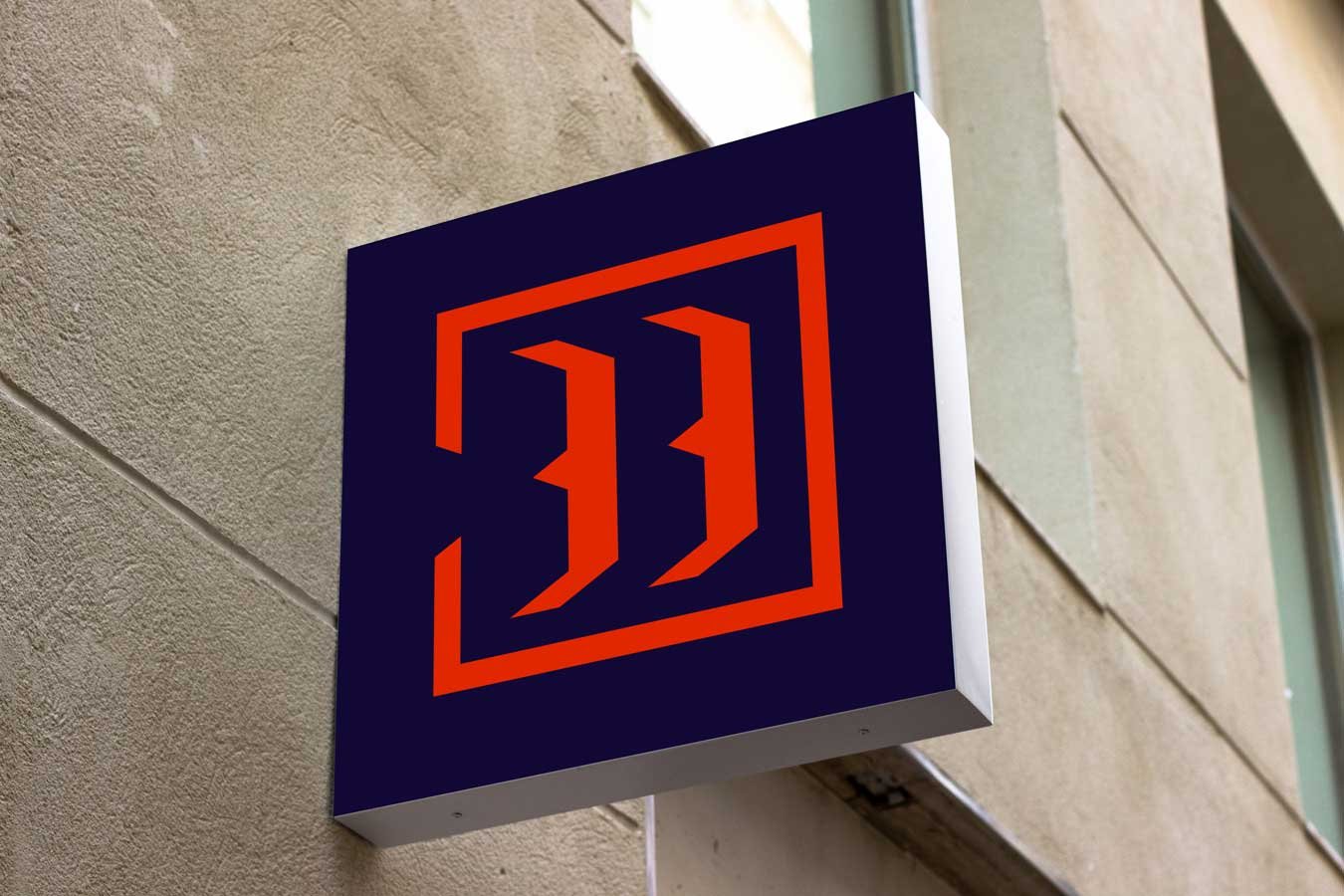
The Blackbird icon consists of two identical forms inside an unclosed square. The two shapes are formed by the negative space of the “B” from the logo — “BB” standing for Blackbird. The square surrounding these two forms is broken open to represent breaking free from convention and the limitless creativity that propels Blackbird to new heights. The design uses the same 30 degree angles as the logo making them feel cohesive. The bold geometric icon evokes a striking and fearless impression.
Colour Palette
The colour palette is daring and sleek with a cool edge and plenty of contrast. The main three colours are complimented with a hit of vibrancy from the two accent colours.
Typeface
Body Copy
Interstate Mono, Regular
Headings
Adobe Caslon Pro, Bold, All Caps, 200 pt Tracking
Font Choice
Interstate Mono is a clean, modern typeface with an industrial feel. The monospaced font has connections to early technology, giving it a retro and utilitarian vibe. Interstate Mono is simple, legible typeface making it perfect for the Blackbird brand.
Adobe Caslon Pro is a sophisticated font that blends historical authenticity with modern refinement. This traditional serif creates a great juxtaposition with the uniform shapes of Intestate Mono. Despite the contrast, the two fonts find harmony in their shared proportions and clean geometric forms. Overall creating a dynamic visual tension that still feels cohesive.
Art Direction
Using the Blackbird brand narrative as my compass I created a brand guide to ensure that future designs are cohesive. The brand guide includes photography style, illustration style, and a graphic element that complements the primary logo and icon. I designed marketing assets to be used in the launch campaign. These tools act as a jumping off point for future designs. They allow for growth and creative freedom while remaining true to the core of Blackbird’s identity.


